Your logo is your visual calling card, so there’s a lot of pressure to get it right! Fortunately, we have a lot of experience working with all kinds of logos, and this blog post is all about two important things to consider when creating a new logo: color and orientation.
A great brand designer will walk you through this process, but it’s important for you to know why these things are important and to make sure you receive multiple versions of your logo.
“Some people think that to have consistent branding, you can have only a couple of logo options, but in reality, with thoughtful planning, you can have an entire suite of logos and an even stronger visual brand because of it.”
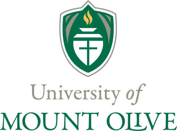
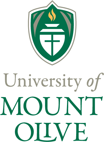
To demonstrate, we are showing off the logos of one of our long-time clients, the University of Mount Olive. UMO has been a client of ours since 2010. The school was known as Mount Olive College when we first started working with them, and in January 2014 changed its name to the University of Mount Olive. Jennifer Merritt, the Director of Marketing, and Rhonda Jessup, the Director of Public Relations, directed the rebranding process, and we are so excited to use their logo as examples.
UMO Full-Color Logo
Number of Colors
We love beautiful, colorful logos! Printing processes have changed so much in recent years, so it’s not too difficult to find products that will show off a colorful logo. Full-color printing tends to be more expensive, so be aware of that.
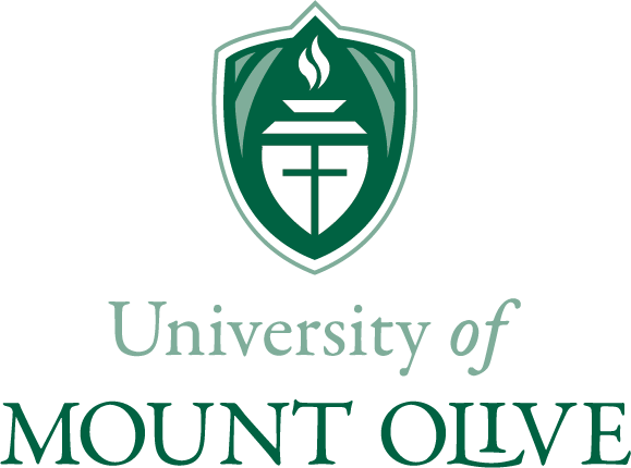
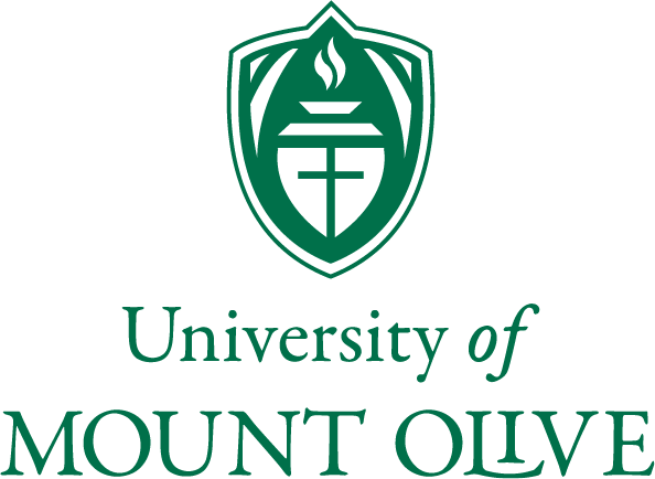
For the most flexibility, if your main logo has more than one color in it, make sure you also have a one-color version with no gradients (shades of gray). Even if you think you will always print in full color, you just never know when you’ll fall in love with a buttery-soft leather notebook and want a subtle, debossed logo.
Gradients are shades of color, so a shade of gray is often considered a different color and not black even if it’s created as a percentage of gray.
UMO Gradient Logo
UMO One-Color Logo
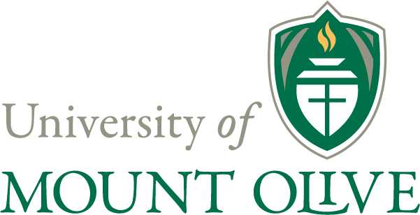
UMO Wide Logo
Orientation
Imprint areas vary greatly among products.Ink pens often have very long but short imprint areas where the equivalent of one or two lines of text is all that is available. A tumbler could have a large imprint area about the shape of a square, and grocery totes have an imprint area that is tall and narrow. All of these different items require a slightly different logo.
UMO Extra-Wide Logo
UMO One-Line Logo
UMO Extra-Tall Logo
The University of Mount Olive did a fantastic job during the rebrand. They have a one-line logo, tall logos, extra tall logos, wide logos, and extra wide logos, as well as various color options. By having so many options, we can decorate anything with a UMO logo and the item stays on brand.
Some people think that to have consistent branding, you can have only a couple of logo options, but in reality, with thoughtful planning, you can have an entire suite of logos and an even stronger visual brand because of it.
We currently do not offer branding and logo design in-house, but please let us know if you have any questions about the process or if you would like help finding the right designer for you. If you are rebranding and want us to look over some logo options, we are happy to help! Email us at info@coastal-connections.com.



Be the first to comment